skip to main |
skip to sidebar
Prelim 2- Magazine Cover and Contents Page- The finished magazine and contents.
For the cover as i stated above we were advised correctly to use a limited colour pallet, this creates an eye catching covert that wont confuse the reader at first glance.
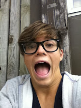
Myself and Hannah both thought the picture of Miles fit perfectly for the purpose of our magazine, being a relevant student body.
The Cover stories we decided to use we joint decisions, we thought they were slightly humorous but still had relevance.
We were both extremely happy with our magazine cover.
Contents --- For the contents page we again chose a limited colour palette for the reasons above. This time we thought to give out contents a more realistic effect we would use a different shot of somebody else. This shows we have backups and have thought further into the design process before hand. We also thought Dani (who we were originally using) has the right look for editorial pieces as she is extremely photogenic.
MYself and Hannah were extremely pleased with the outcome of our contents page and believe we followed the brief well.
:)


Jack.
ReplyDeleteThis post gives a good overview of the magazine you've created. What you need to do now is follow the slightly more formal structure provided by Mr Ford. Look at the AS homepage to find the guidelines (or alternatively view Alex Farnell's blog).
Well done.